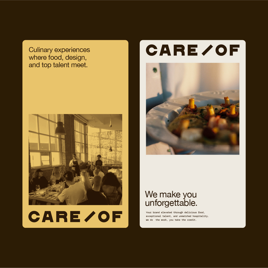
Care/Of
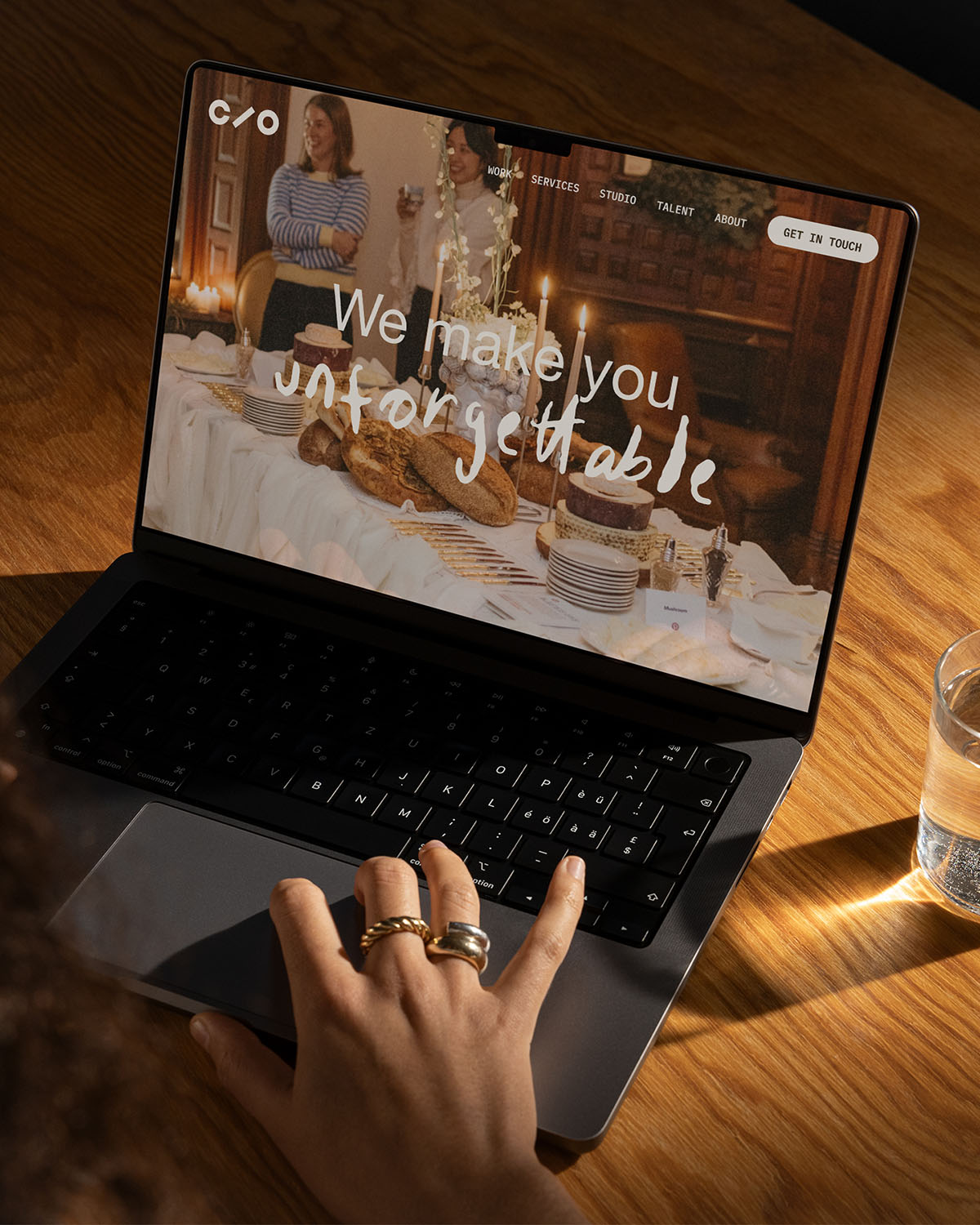
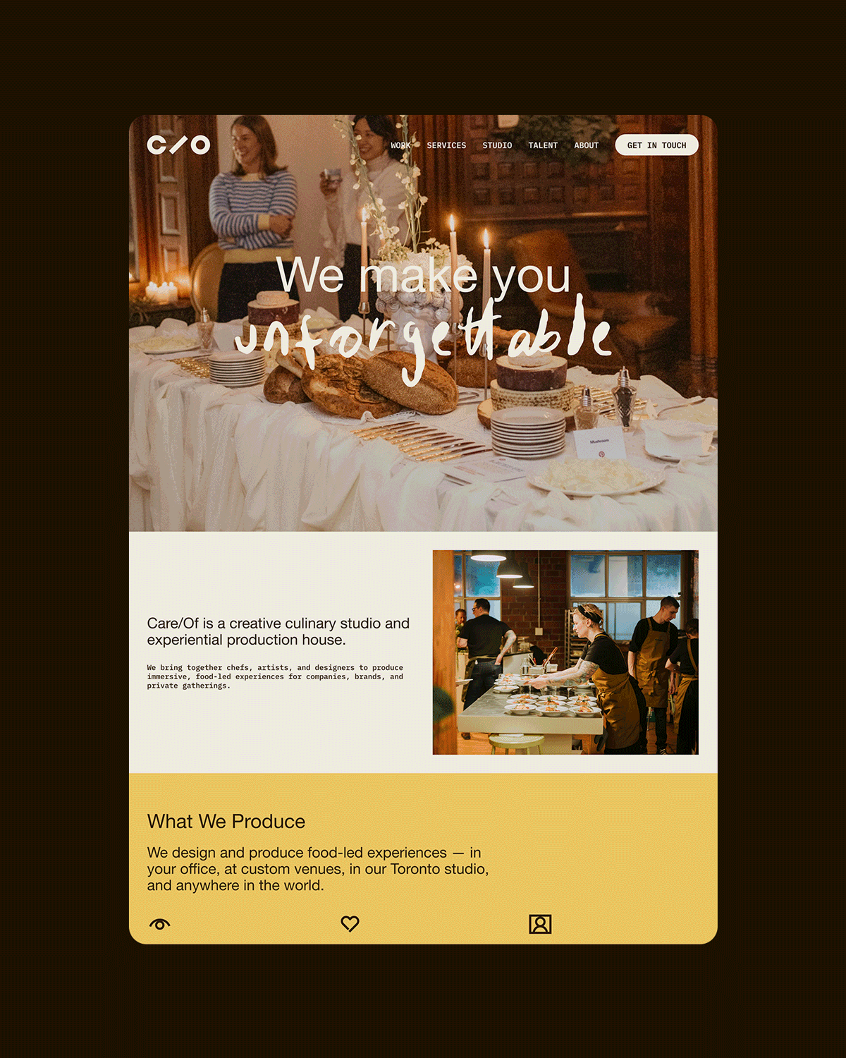
Care/Of is a creative culinary studio that designs unique experiences and events in Toronto. As they pivoted their offerings to focus on hospitality and food experiences, Bridget, the owner of Care/Of, wanted a brand refresh that better reflected the studio's new culinary era. I worked on optimizing their existing wordmark and created a modular system that was bespoke and elevated, but also practical and easy to use.
Client: Care/Of
Creative Direction & Design: Marta Ryczko
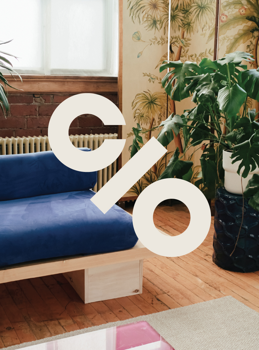
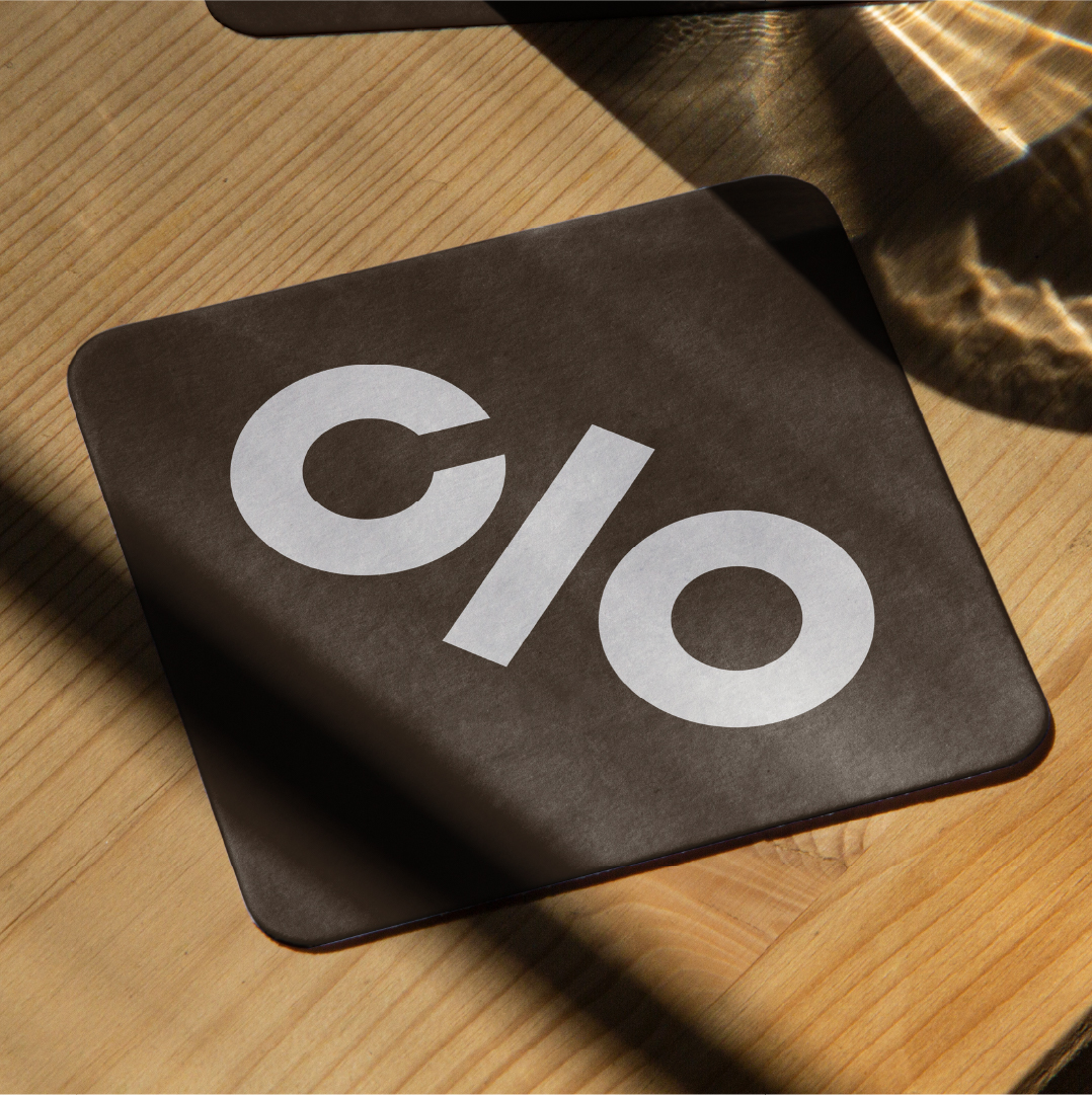
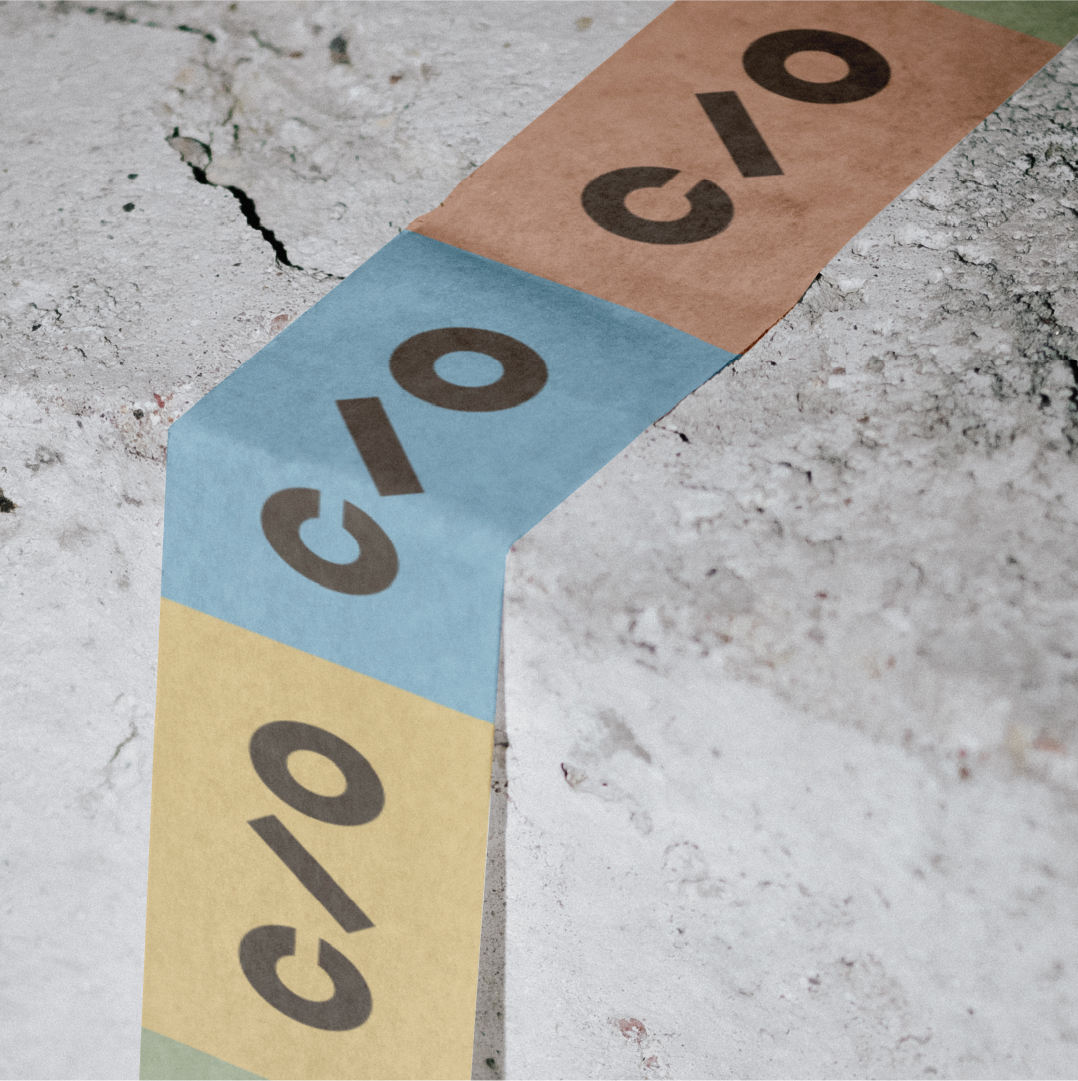
Care/Of already had a strong wordmark designed by Salitabacchi, but I made a few minor adjustments to optimize it for different uses and scales. I also created two icon variations for instances where the full wordmark isn't needed.
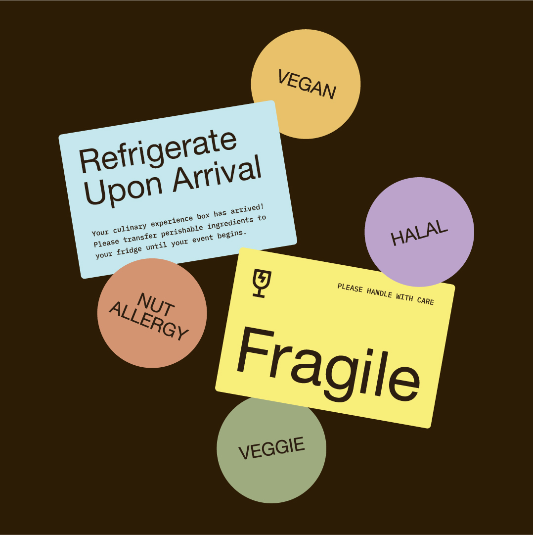
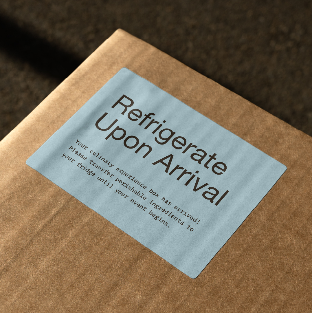
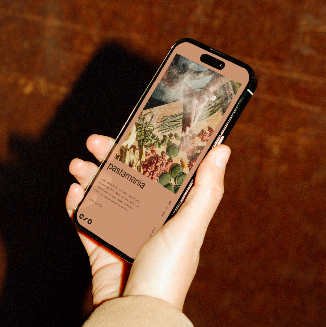
In addition to the wordmark adjustment, I developed a suite of functional and informational icons for Care/Of to use in their decks and guides. The icons heavily borrow from the simple geometry of the primary brand wordmark.
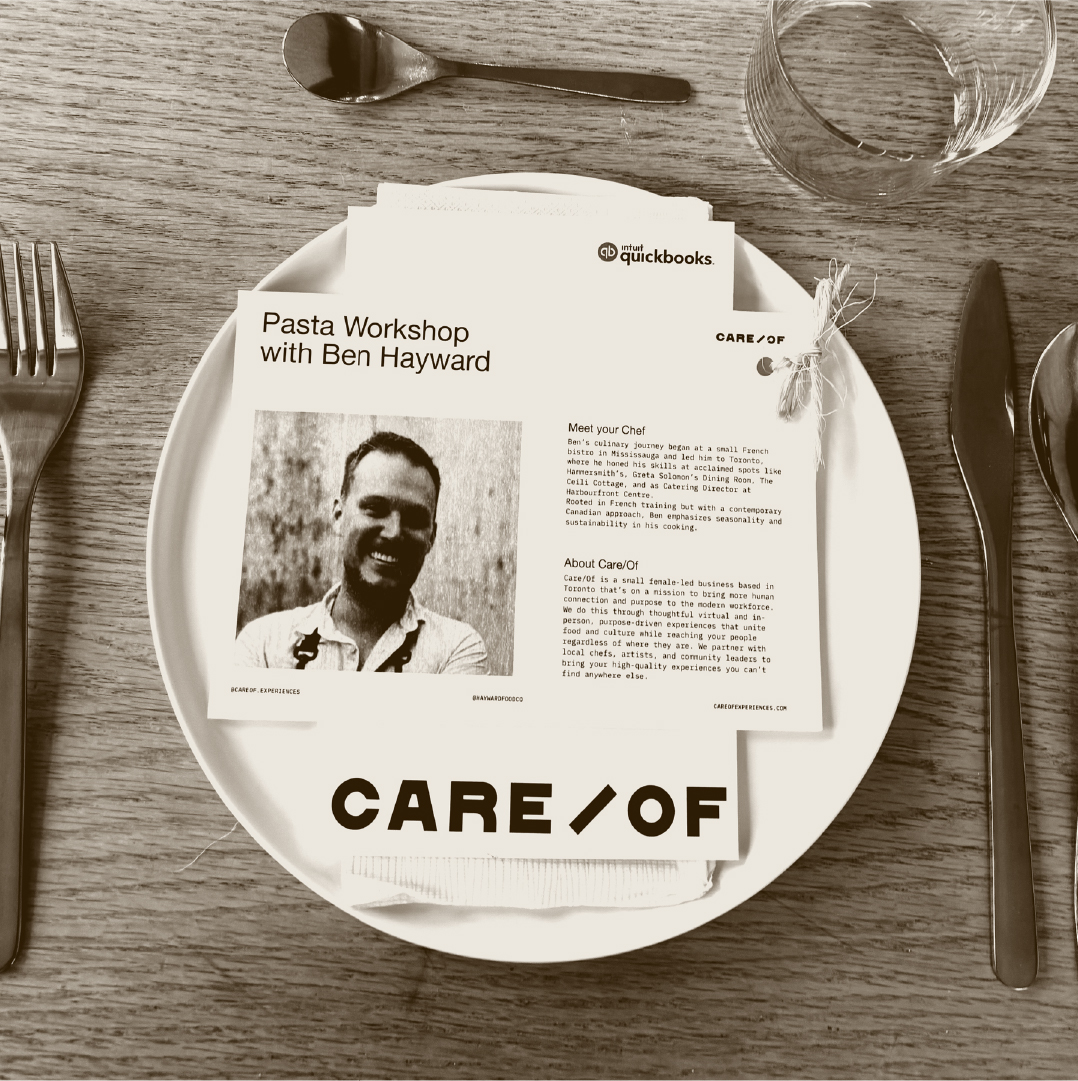
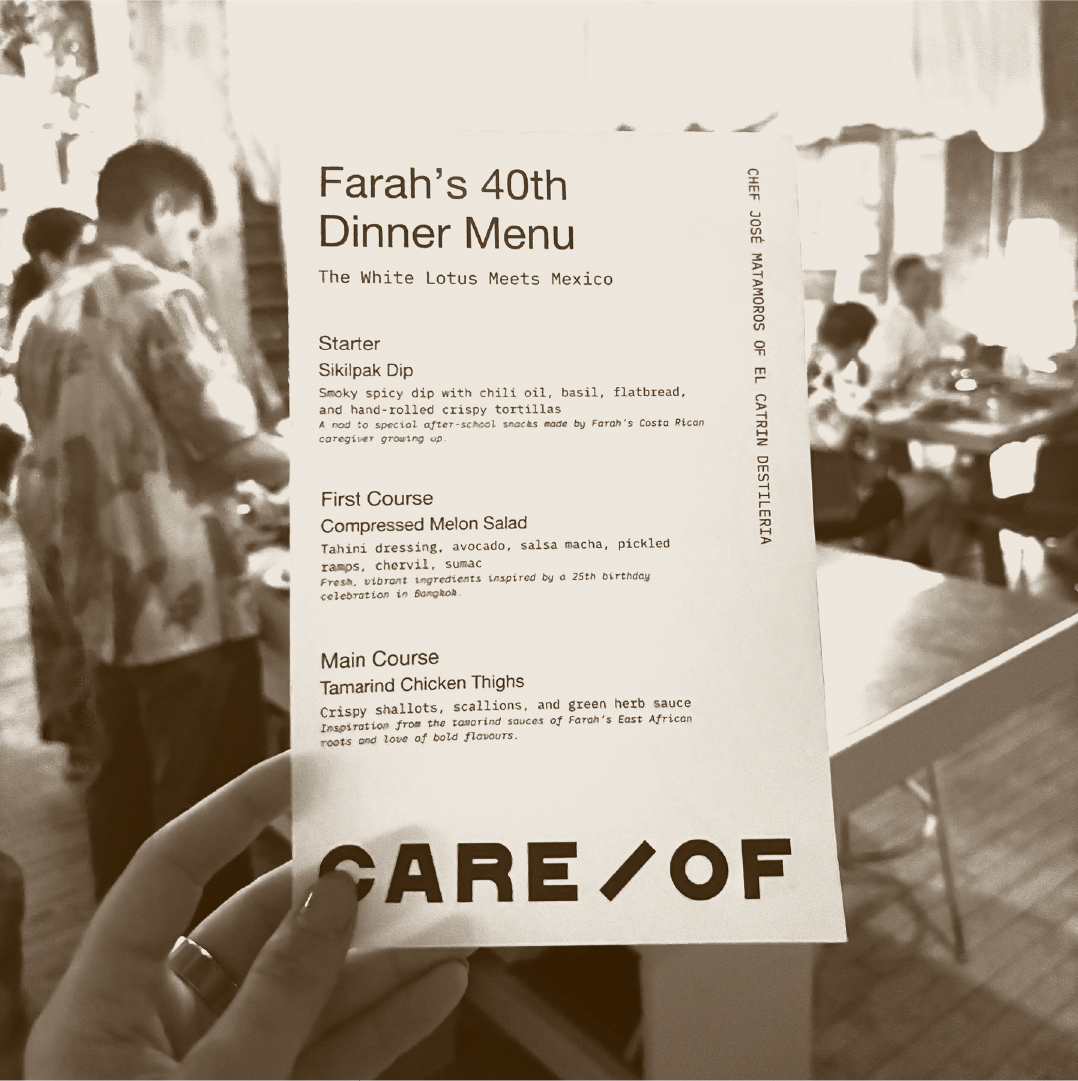
I also developed a strict but accessible grid structure and typographic hierarchy that Bridget's team can easily adhere to. Because the brand is quite minimal in terms of it's visual language, having an underlying structured grid allows the brand collateral to have an elevated editorial style. I kept Helvetica Neue from their original brand, but introduced IBM Plex Mono for body copy and typographic details and a hand-written font, Manic, for detailing and emphasis.
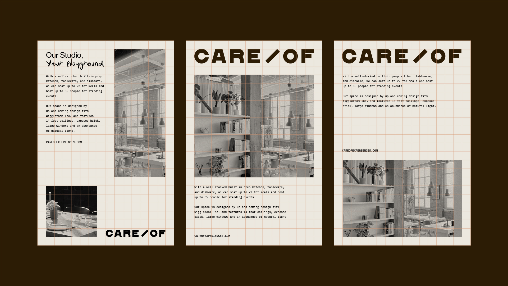
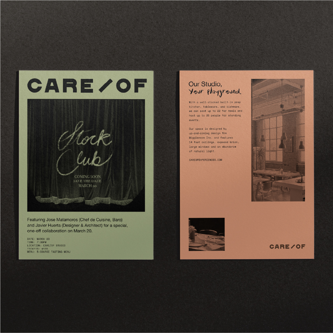
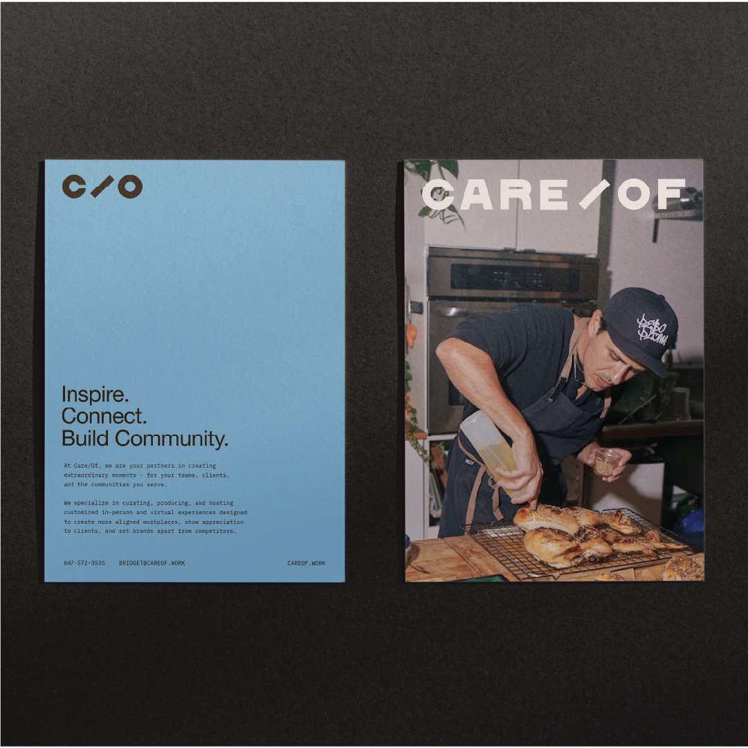
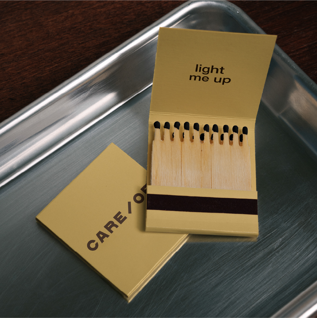
Because Care/Of is an event space with many moving parts, most of the printing they need is done internally on an office printer. I made sure that any stationery templates I designed would be easy to print, practical, and still feel elevated. Because they use a black-and-white printer, there was an opportunity to lean into purchasing custom paper stock that would add an edge and a pop of colour to their printed pieces. I also developed templates for some evergreen collateral, such as promotional postcards, that would be printed professionally and in full colour.
Stooodio Dooodle
I’ve been posting a new design every day since 2018! Explore the project on instagram.
© Marta Ryczko 2026