Paradise Theatre
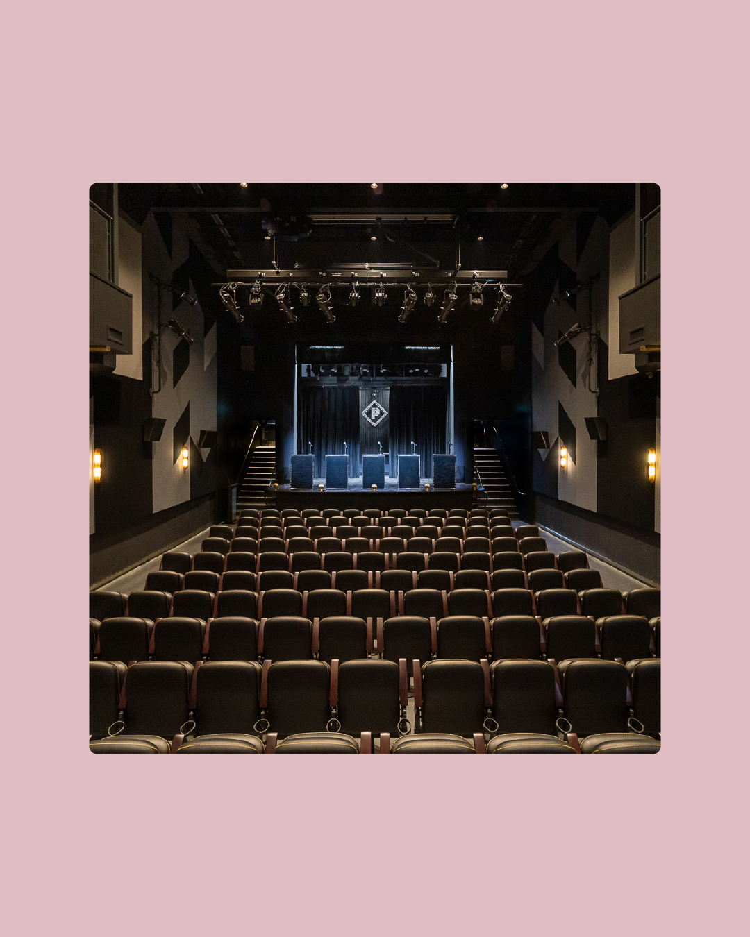
Paradise Theatre is a historic multi-arts venue in the Bloorcourt neighbourhood in Toronto. The building has been around since 1937, lived through many different eras and iterations (including an adult theatre!), but in 2019, it was restored and reopened to its full cinematic glory. During my tenure at Sovereign State, I was the lead designer for the Theatre's brand development. Under Creative Director Joel Gregorio's direction, I developed a mark and system that celebrates the building's heritage while ushering it into a new era of movie-going. As a cinephile, this project is near and dear to my heart and I love the third space it's become.
Client: Paradise Theatre
Creative Direction: Joel Gregorio
Art Direction & Design: Marta Ryczko
Project Management: Arnold Fidelino, Marta Ryczko
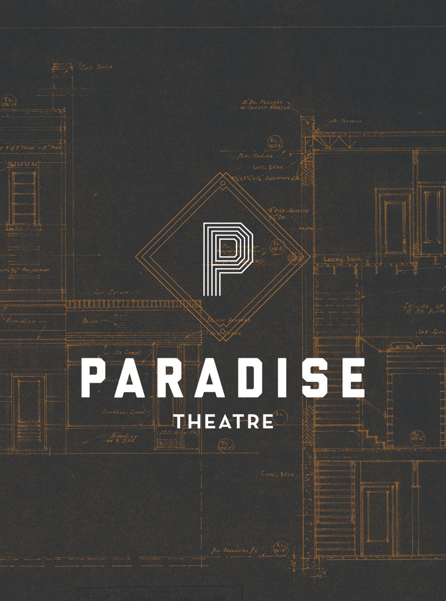
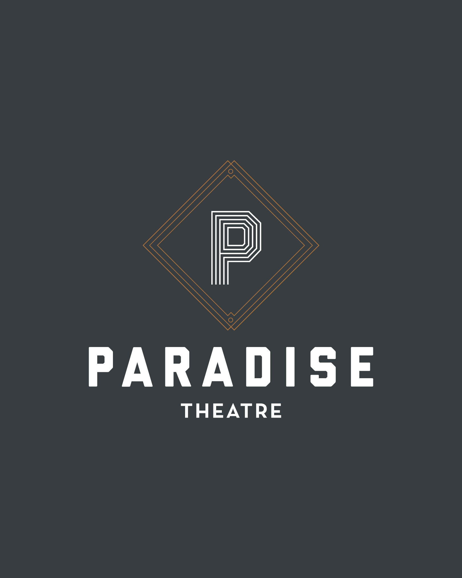
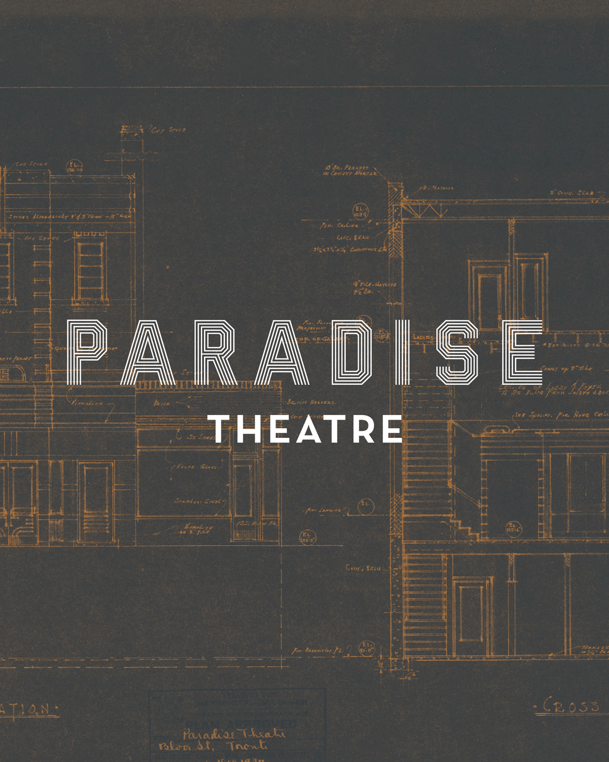
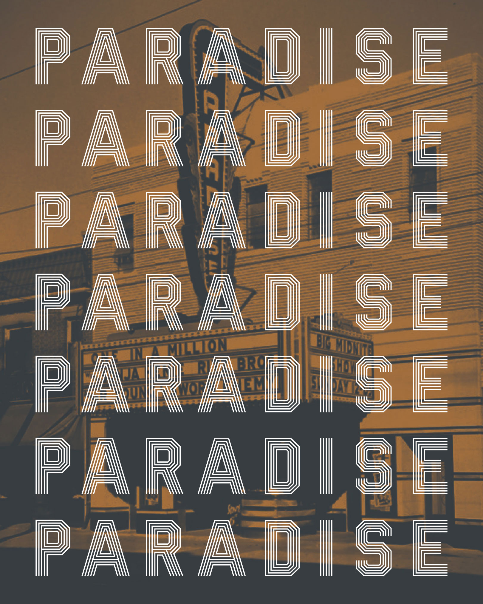
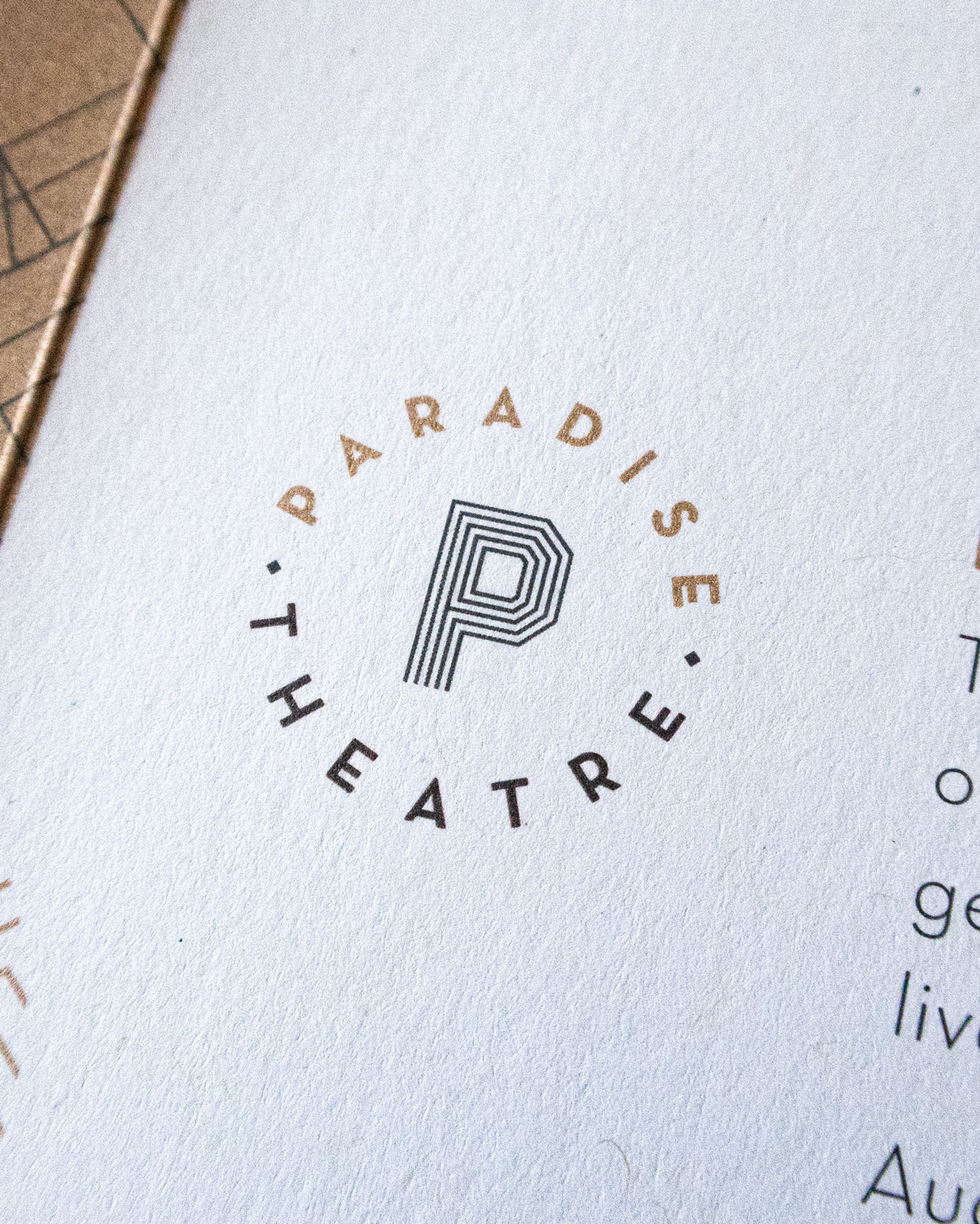
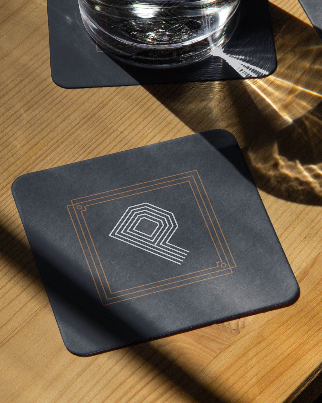
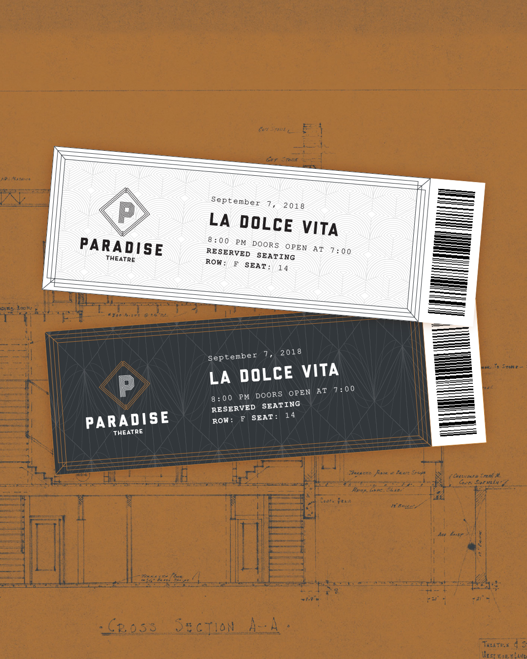
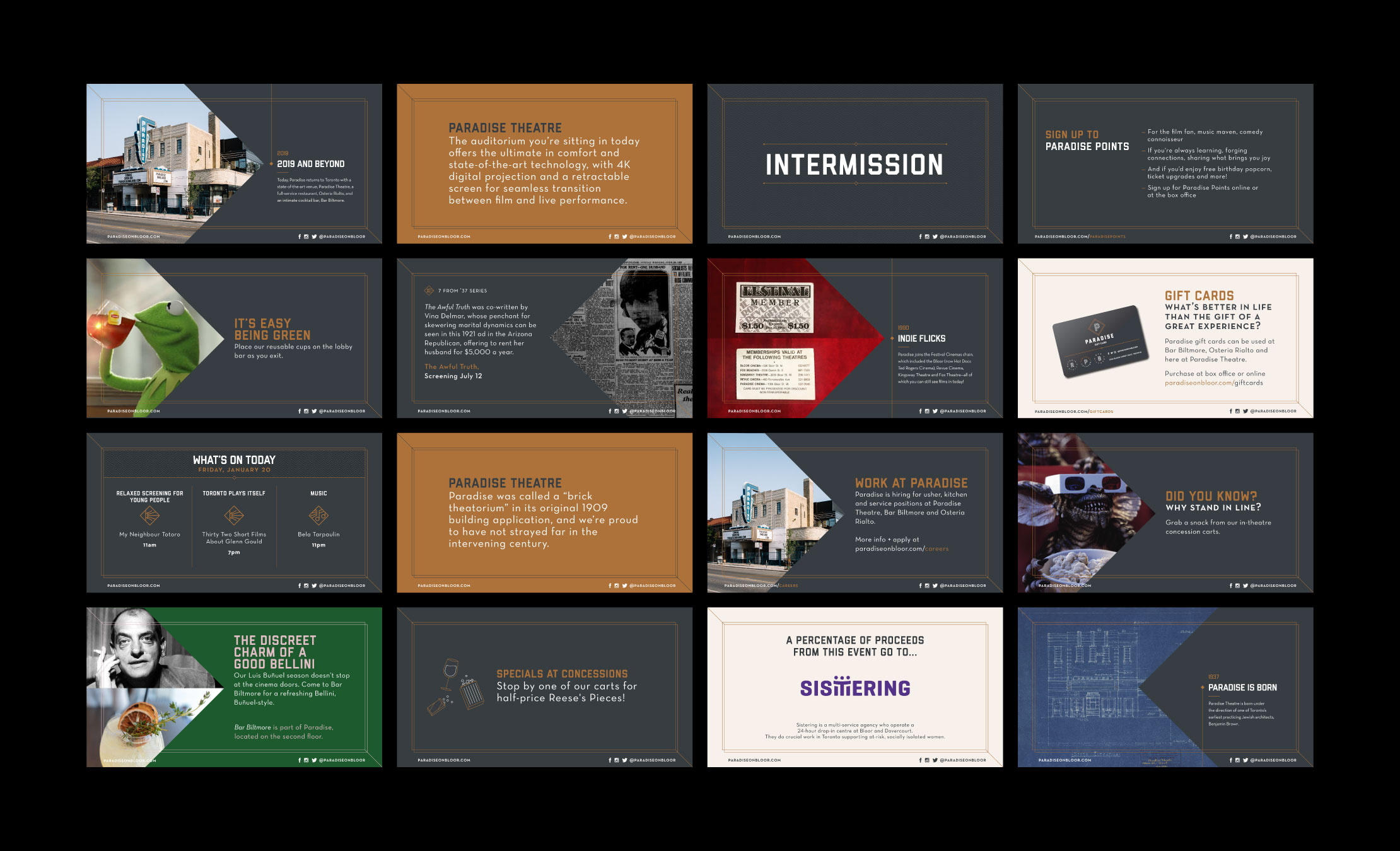
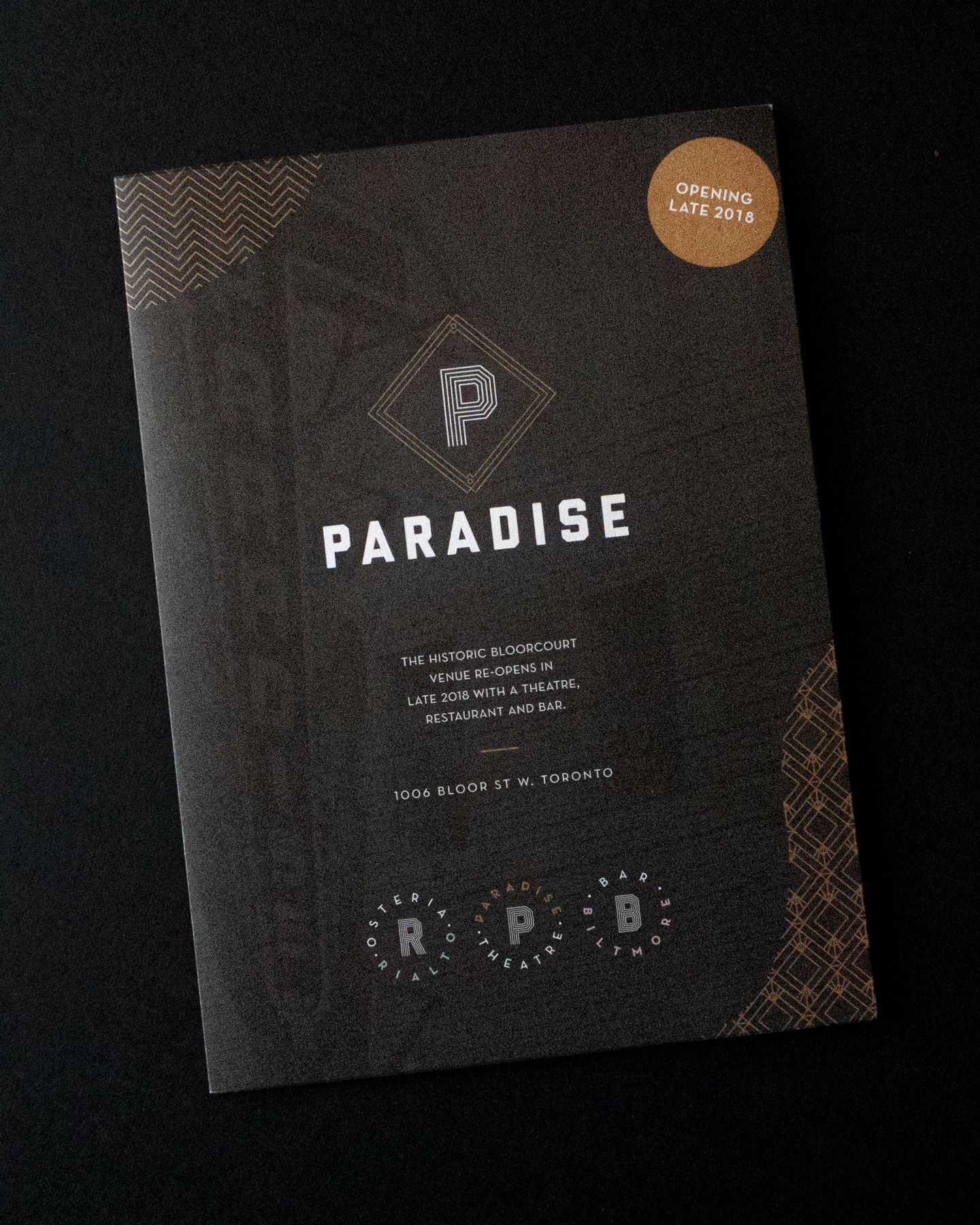
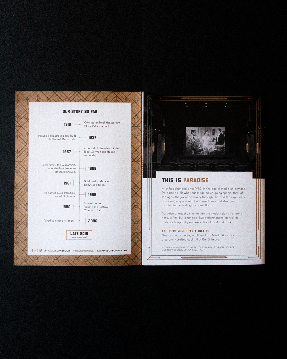
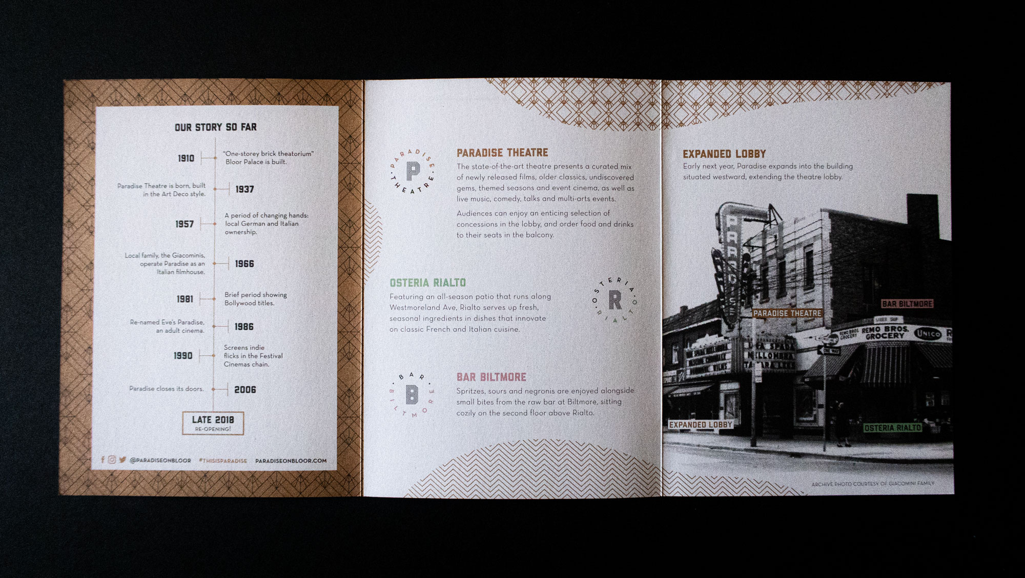
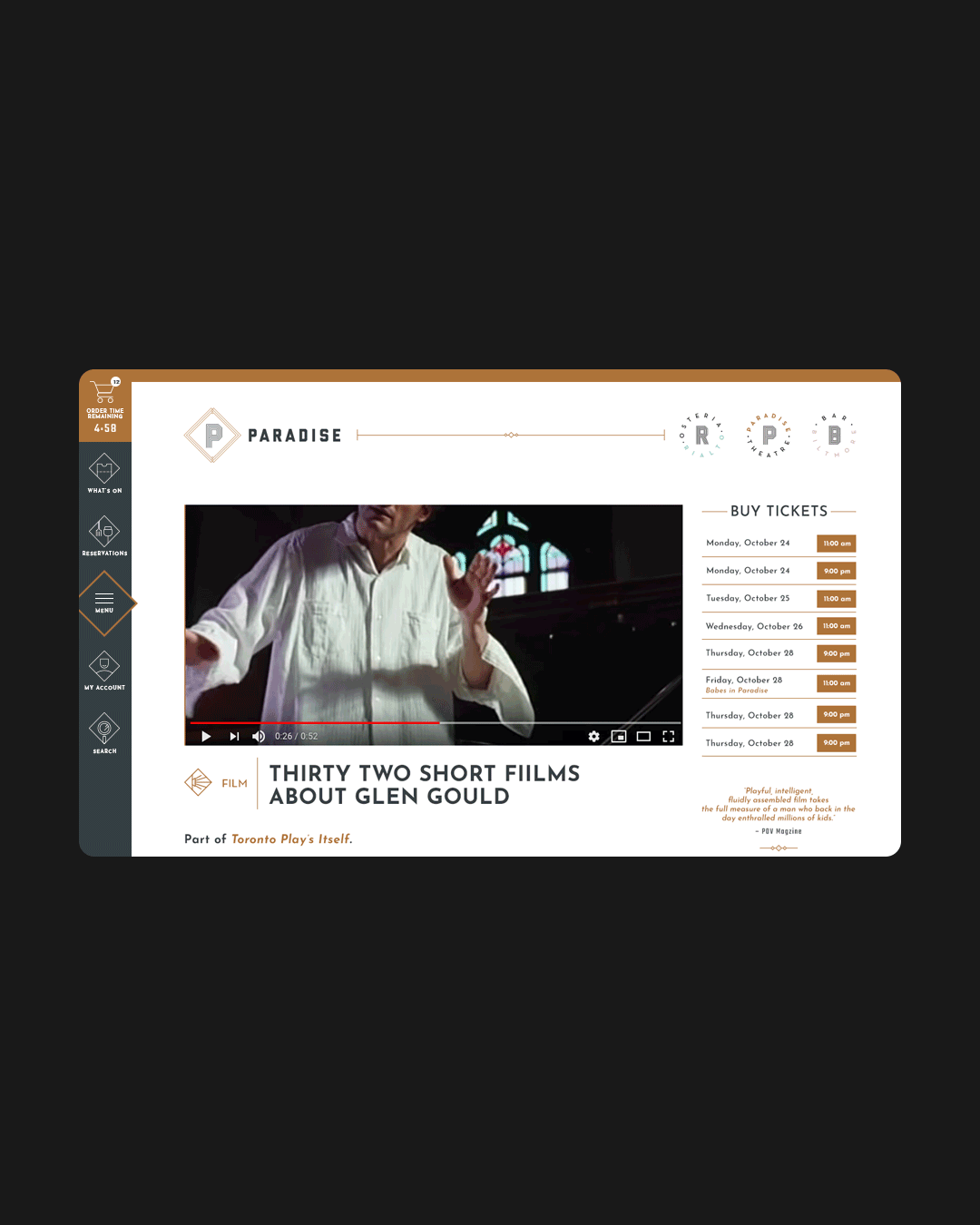
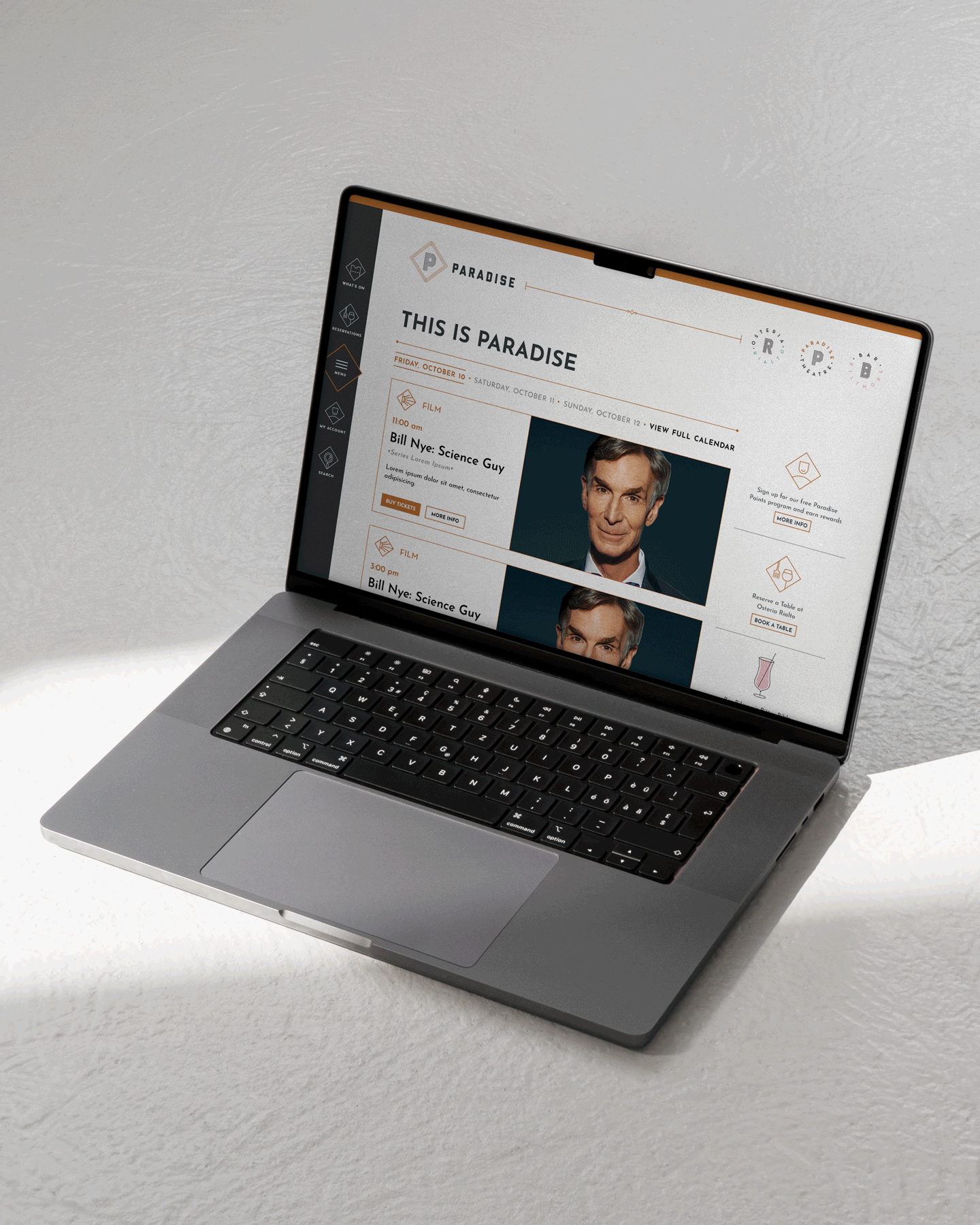
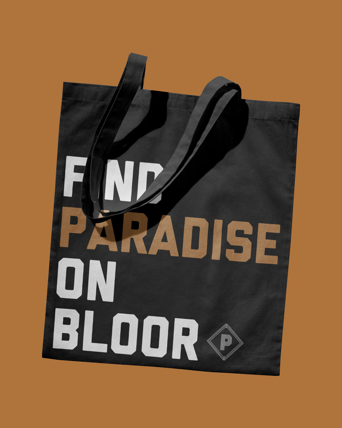
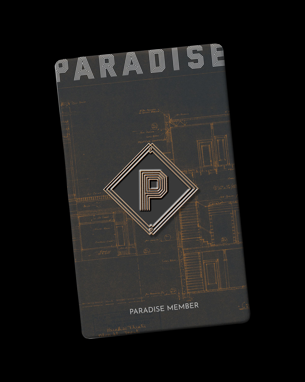
The main brand mark is an Art Deco-inspired monogram lock-up that pays homage to the original building that opened in 1937. We expanded that brand mark to a suite of alternative lock-ups, creating flexibility and whimsy.
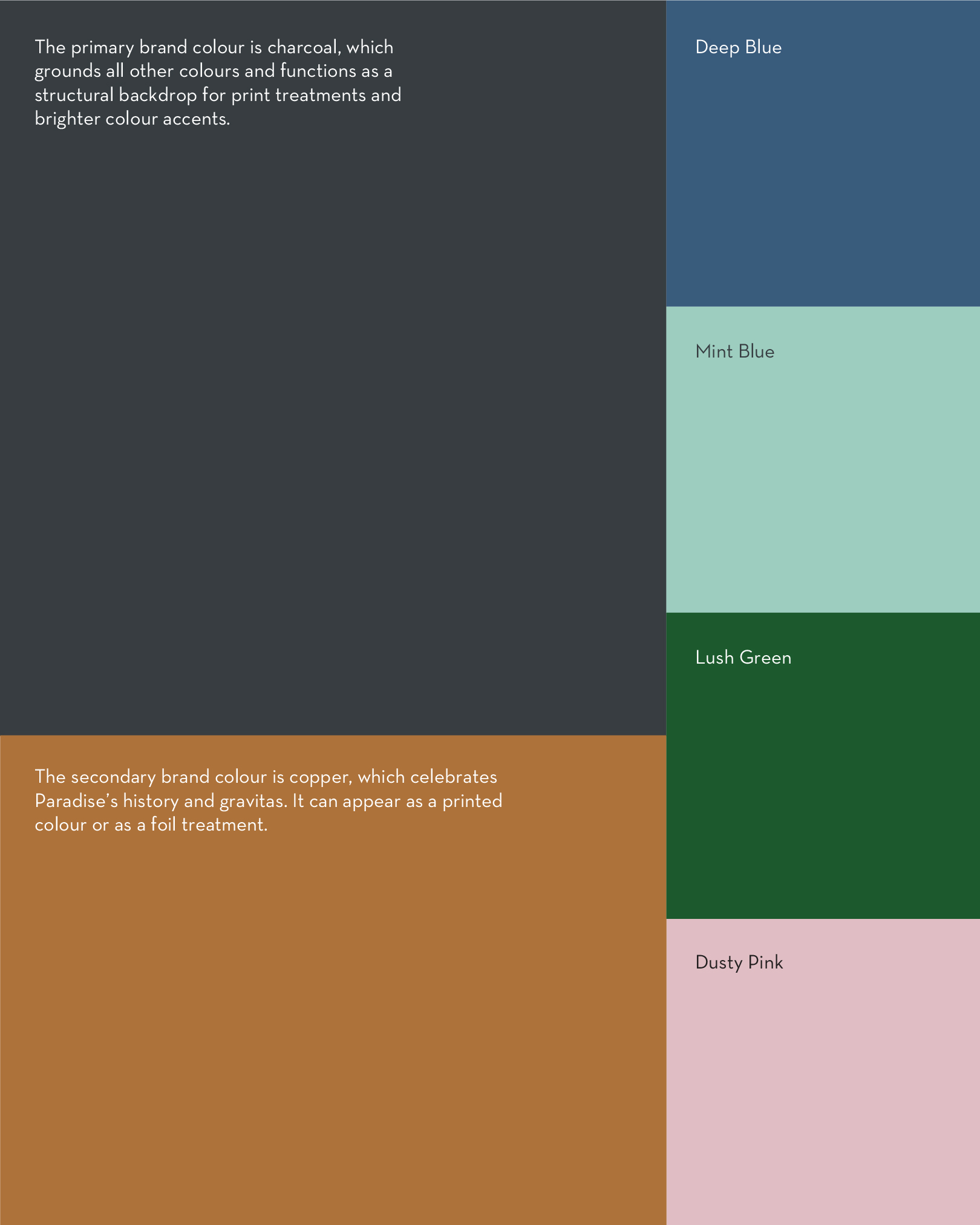
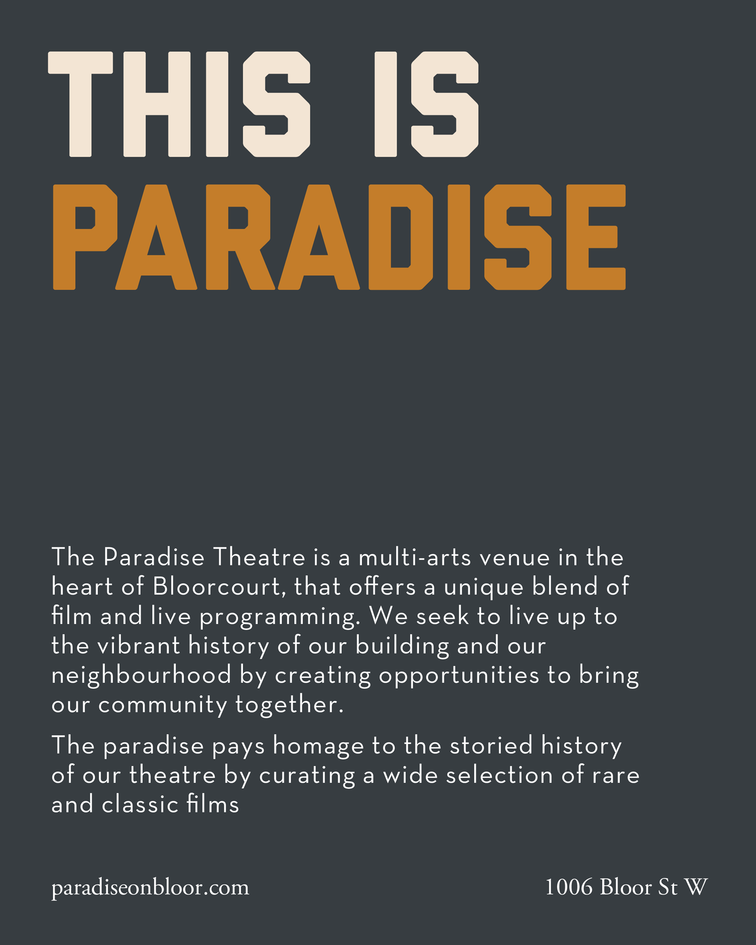
The colour palette is simple yet sophisticated, referencing the materials used in the renovation of the theatre. Because the marketing materials for Paradise screenings often use images from the films themselves, the palette is there to support brand recognition without taking away from the content itself. The typography system uses a mix of classic typefaces like Garamond and Neutra, paired with the blocky, vintage-inspired Liberator.
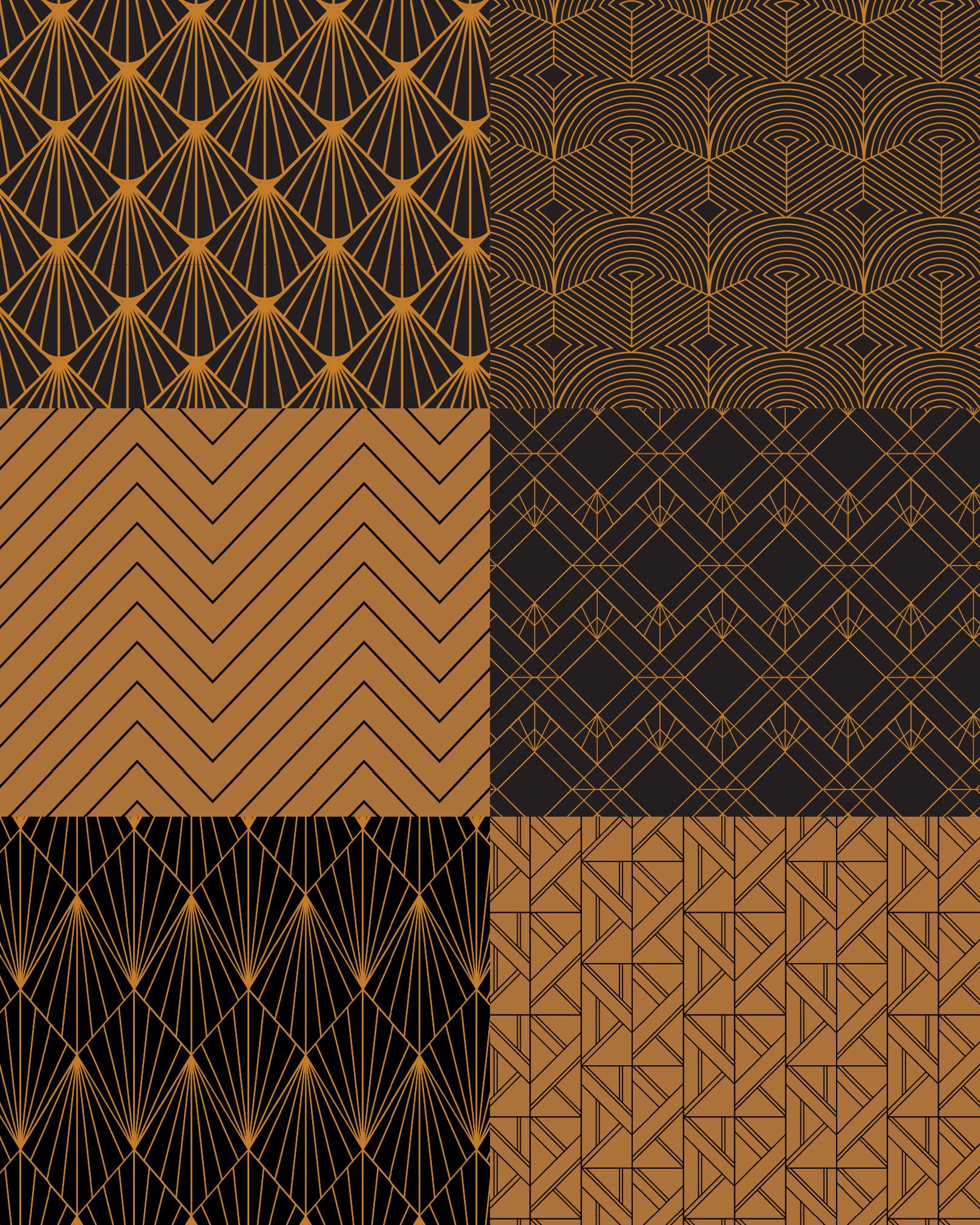
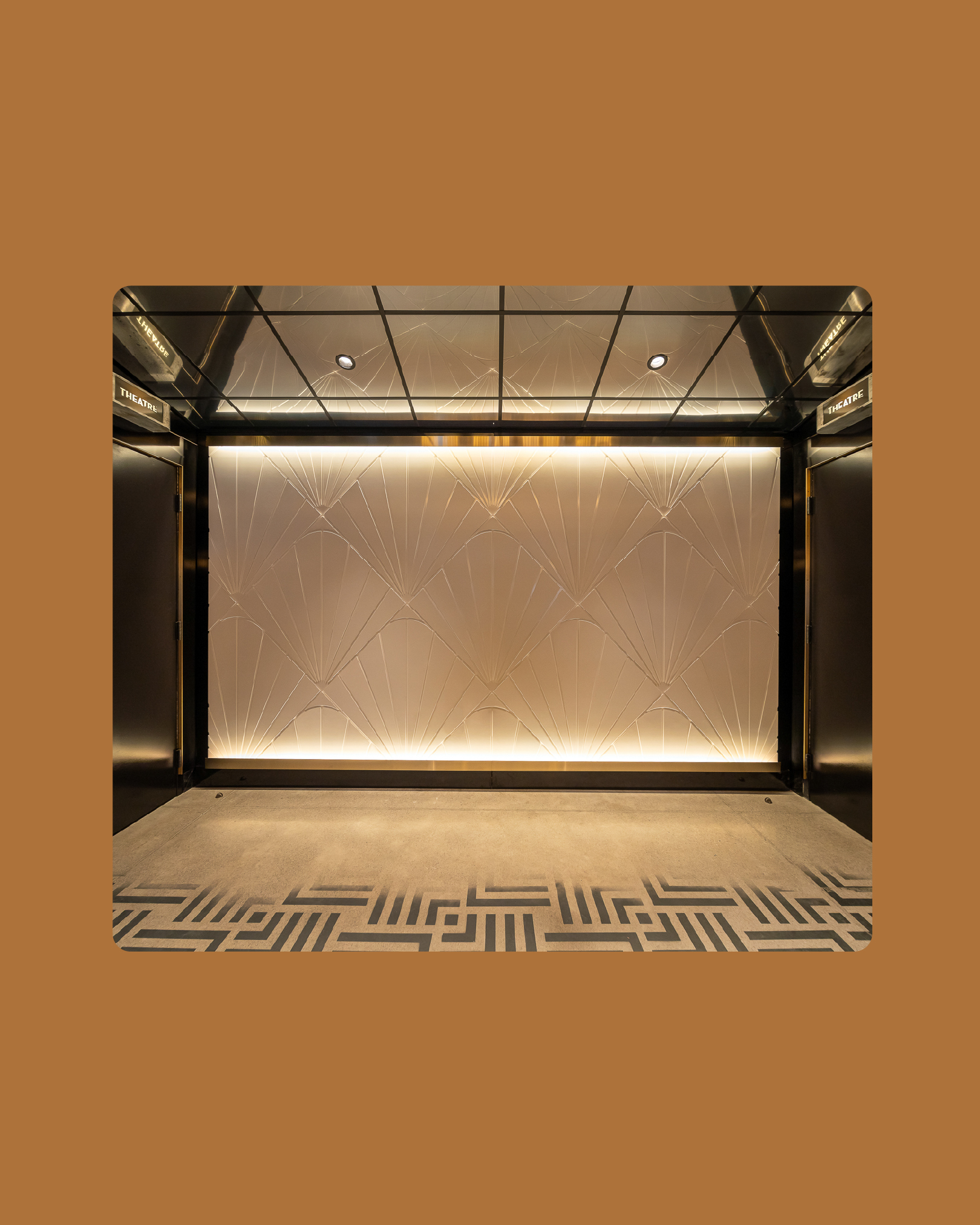
A library of patterns was developed in connection with the historical roots of the Paradise, referencing Art Deco motifs through a contemporary lens. These patterns inspired the interior architecture team to apply them to high-visibility points in the lobby.
Stooodio Dooodle
I’ve been posting a new design every day since 2018! Explore the project on instagram.
© Marta Ryczko 2026