Ok Play
OK Play is a science-backed play app for kids and their caretakers whose mission is to help “families be OK with exactly where they are right now”. The games and activities in the app encourage users to explore and play in the real world and in the world that OK Play built. I worked with the team to design a friendly brand system that highlights that being a caretaker is not always perfect, but it is an adventure. The Ok Play brand exemplifies the ups and downs of raising kids while signifying that being imperfect is OK.
Client: Ok Play
Creative Direction & Design: Jonas Carlsson
Art Direction and Design: Marta Ryczko
Illustrations: Chie Boyd
Brand Photography: Jorge Cuevas Jr.
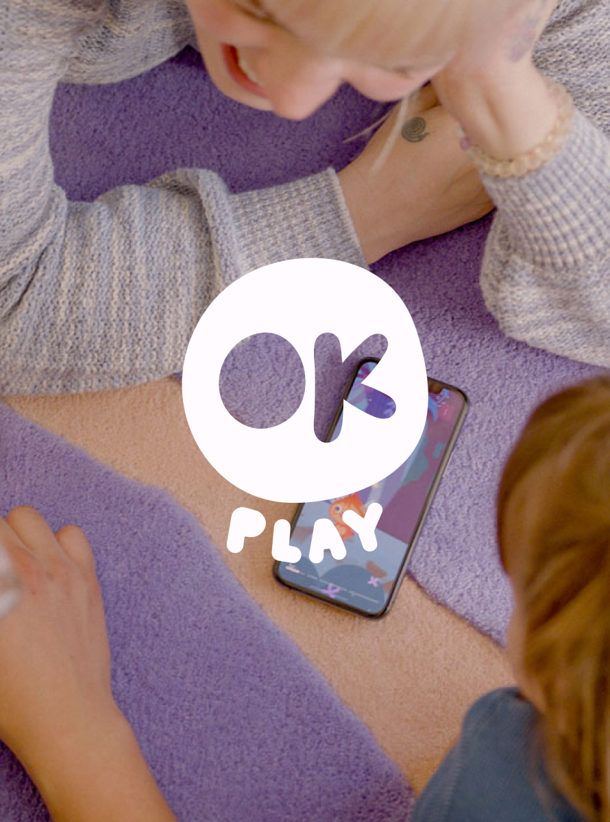

Being a caretaker is not always perfect, but it is an adventure. The OK Play circle is used to convey that idea of imperfection, but also connection and togetherness. The shape is used as a connective thread throughout the brand.
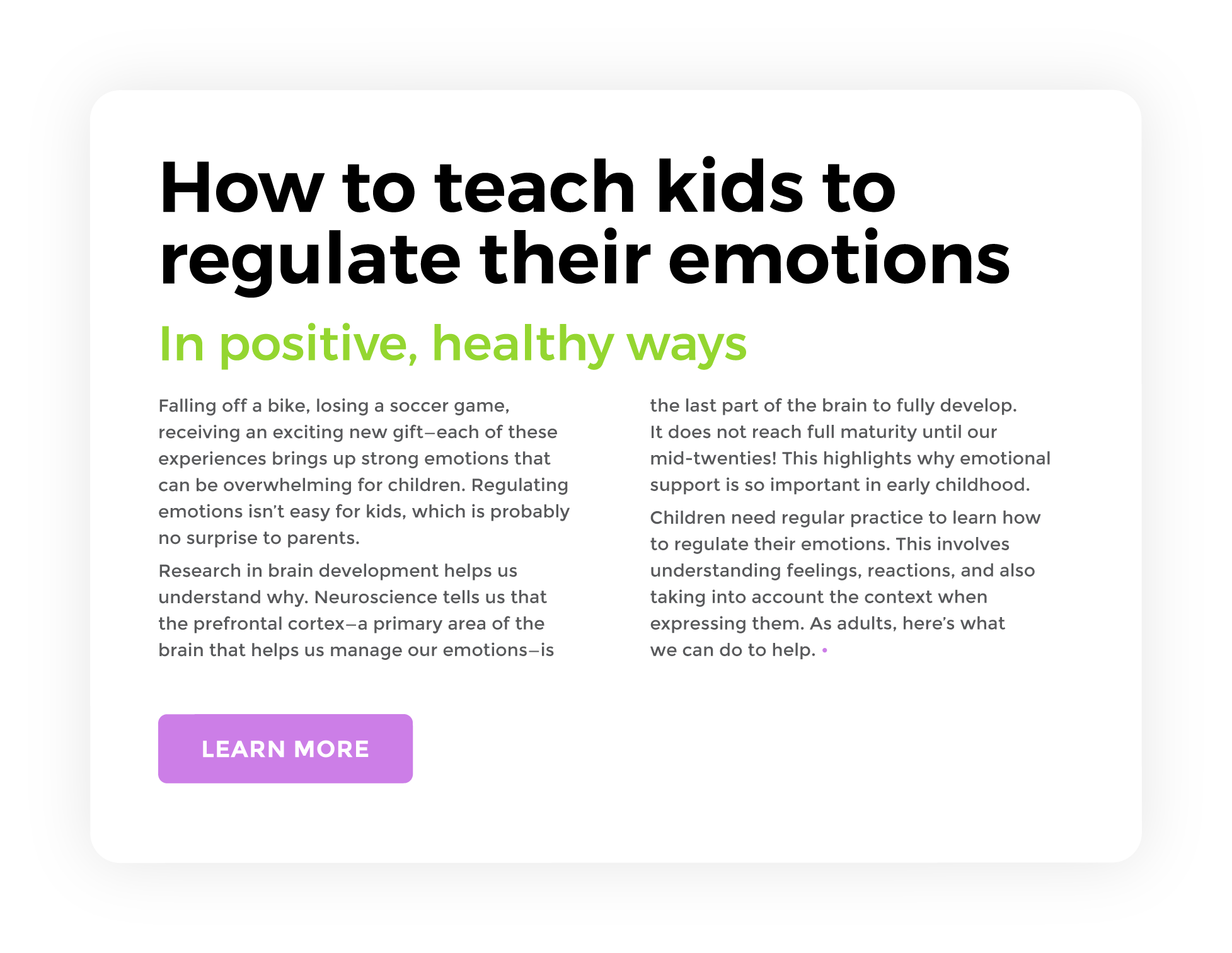
The app already was in development when I was asked to come on board so the typography was informed by the early work done by the product designers. Montserrat, although common, was the perfect typeface to use for the brand as it worked well in the digital and printed space. The open and friendly geometry aligned with OK Play’s brand values.

The OK Play colour palette is vibrant and approachable without being too primary.
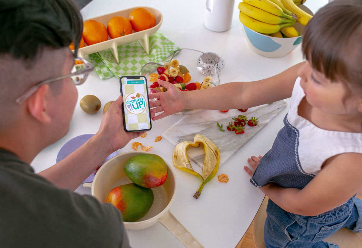
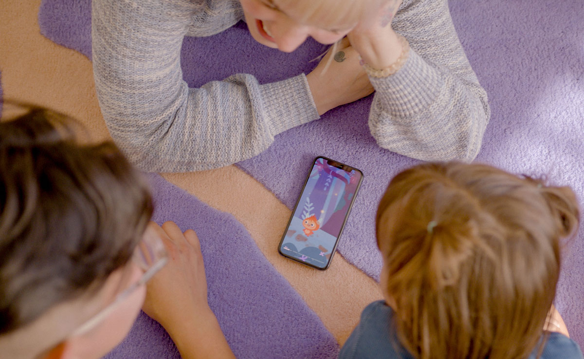
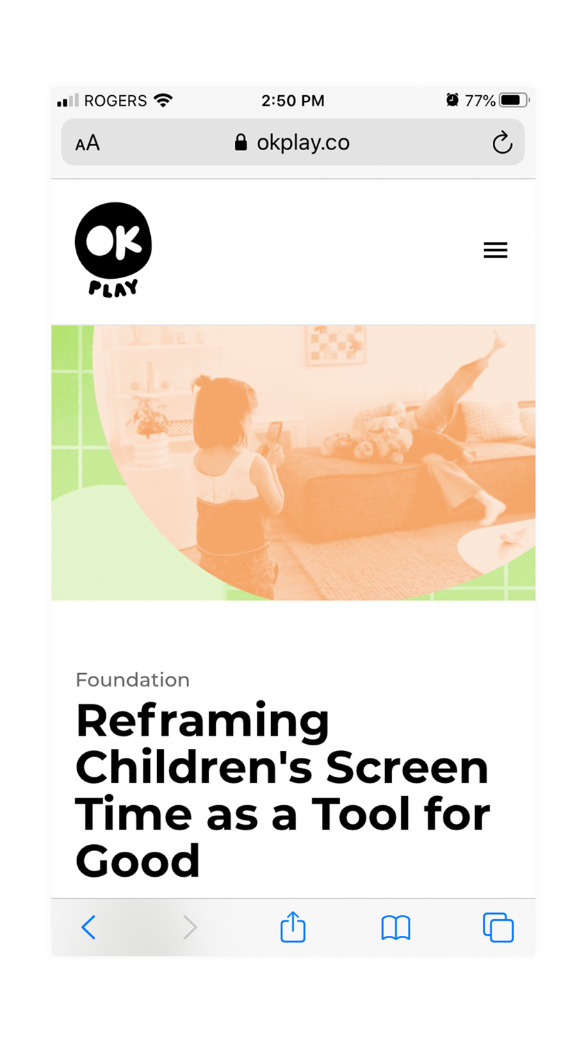
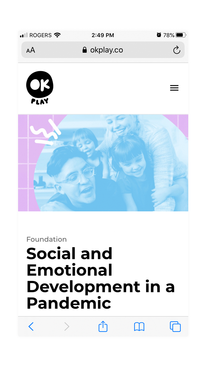
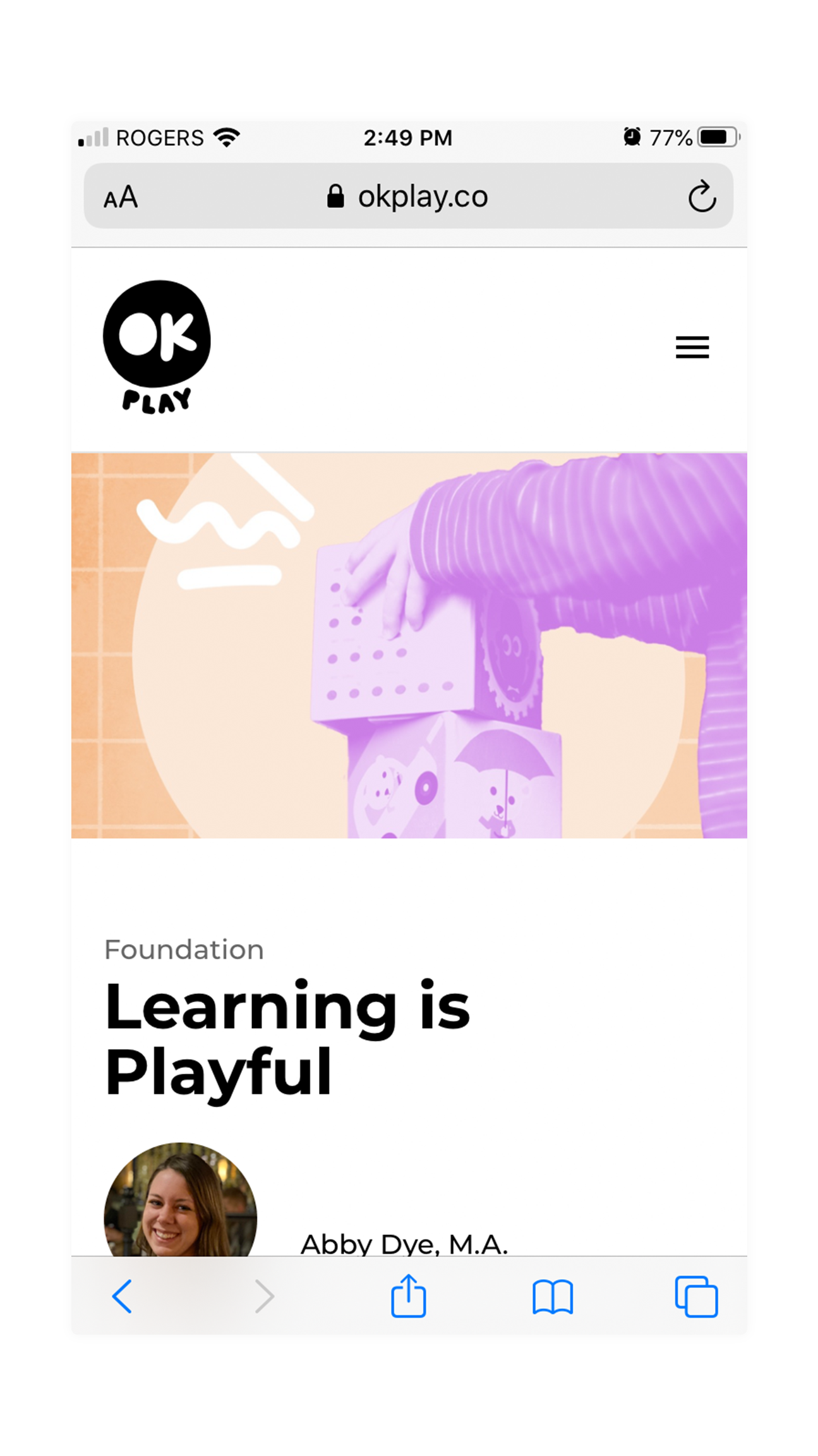
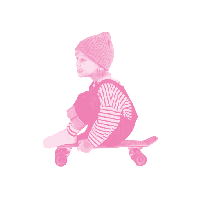
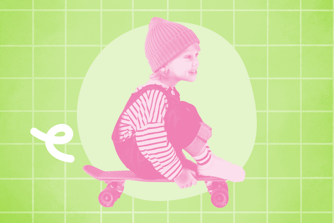
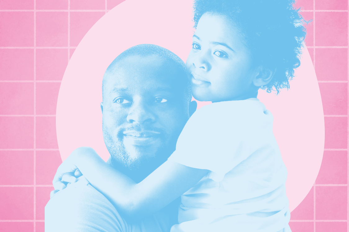
OK Play has a variety of lifestyle images and videos shot by Jorge Cuevas Jr to be used in marketing and for social. There was also a need to develop a look and feel when the brand needed to use stock images for blog posts. Stock images were treated using the brand’s monotone colour style and were close-cropped. Photos always highlight the caretaker relationships and as well as different types of emotions.

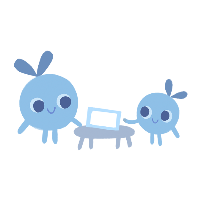

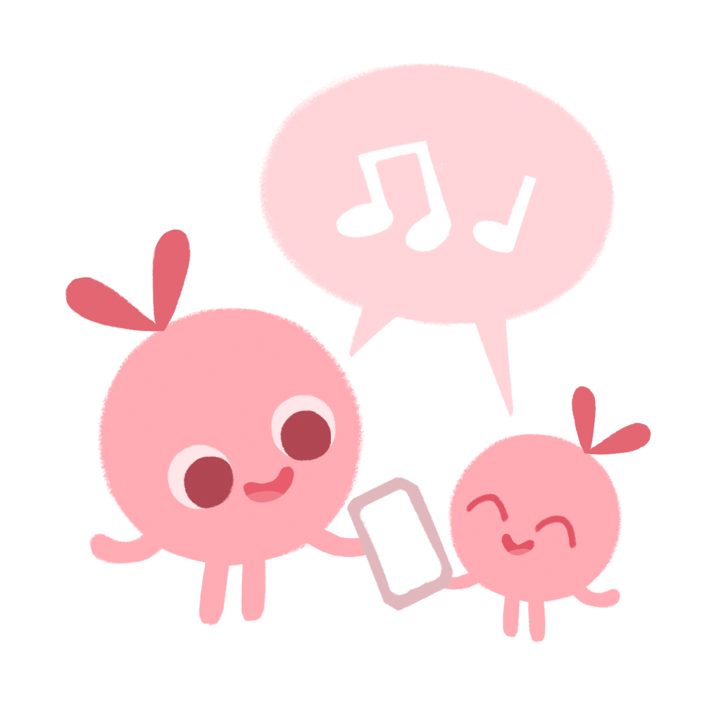
The in-app games feature an entire animated world and characters. These little “Boops” illustrated by Chie Boyd are used sparingly outside of the app.


Using all of the brand ingredients we were able to develop a brand identity that felt easy-going, playful, imperfect and gentle.

Stooodio Dooodle
I’ve been posting a new design every day since 2018! Explore the project on instagram.
(C) Marta Ryczko 2024
